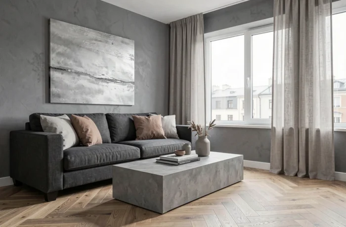
A gray mottled sofa placed in a north-facing living room suddenly makes the space feel colder than expected. The issue doesn’t stem from the gray itself, but from its undertone and the accompanying light. Incorporating gray into your interior decor requires some concrete decisions, well beyond simply choosing a shade from a color chart.
Gray Undertone and Actual Light: The Test to Do Before Buying
A gray can lean towards blue, purple, brown, or green. On a screen or under store lighting, these nuances go unnoticed. At home, they become pronounced depending on the room’s orientation and the type of bulbs installed.
Cool LEDs accentuate the bluish aspect of a gray, while warmer lighting brings out its beige or olive undertones. We’ve all seen a “perfect” gray in a store turn out to be quite austere once placed in a windowless hallway.
The most reliable method remains to place a sample directly on the concerned wall and observe it at various times of the day, natural light in the morning, artificial lighting in the evening. This simple test avoids unpleasant surprises, especially for north-facing rooms where natural light already leans towards the cold. Among Bricotage’s gray decor inspirations, there are setups that illustrate this interaction between gray and ambient brightness well.
Slightly warm grays (brown or soft green undertones) pair better with natural wood, aged brass, or oat-colored textiles. Bluish grays, on the other hand, work well with bolder combinations: pure white, black, chrome metal.
Gray in Living Room Decor: Combine Materials Rather Than Piling Up Shades
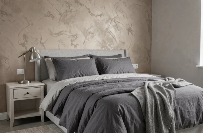
The classic temptation is to use gray on all surfaces: light gray walls, medium gray sofa, dark gray rug. The result is often flat. It’s the contrast of materials that adds depth to a gray living room, not the accumulation of similar shades.
A matte gray wall paired with a velvet sofa in a nearby tone works as long as very different textures are introduced around. Raw wood (oak, walnut) immediately breaks the monotony. A thick wool throw placed on a gray sofa adds warmth without introducing color.
Accents That Change the Atmosphere
Rather than choosing a “trendy” accent color, it’s better to think in terms of proportion. One or two cushions in a bold tone (ochre, terracotta, sage green) are sufficient. Beyond that, the accent becomes dominant, and gray loses its role as a backdrop.
- Aged brass or copper on lighting fixtures and handles warms up a gray living room without overloading the palette.
- Green plants create a natural contrast that works with all gray undertones, from the coldest to the warmest.
- A light wood or rattan coffee table introduces an organic material that prevents gray from becoming too mineral.
Opinions vary on the combination of gray and yellow, which has been prevalent in magazines in recent years. In practice, bright yellow quickly becomes tiring in a daily living space. A muted mustard yellow ages better.
Air Quality and Choosing Gray Paint: An Often Ignored Criterion
When repainting a living room or bedroom in gray, the paint’s composition matters as much as the shade. Low volatile organic compound (VOC) emission paints are now widely available, but not all gray ranges are equal in this regard.
In France, labeling of volatile pollutant emissions (class A+, A, B, C) is mandatory on paint cans. Aiming for at least class A+ limits exposure to VOCs in enclosed spaces, especially bedrooms. It’s a simple reflex to adopt when purchasing.
Some eco-friendly paints offer gray ranges formulated with mineral pigments. The finish is often more matte and deeper than with standard acrylic paint. A matte mineral gray absorbs light differently and gives a more textured effect to the wall, which can compensate for the absence of wallpaper or decorative coating.
Gray in 2025-2026: A Neutral Among Others, Not a Default Choice
Recent trends show a shift towards warmer neutrals: beige, taupe, clay, brown, olive. Gray hasn’t disappeared, but it no longer solely occupies the realm of “go-to” colors.
Gray works better when integrated into a natural palette than when used as a dominant color. A charcoal gray accent wall in a room with off-white walls, paired with wooden furniture and linen textiles, produces a more current result than an all-gray look on four walls.
“Greige” (a contraction of gray and beige) exemplifies this evolution well. This intermediate tone adapts more easily to changing light and appears less clinical than pure gray. For living spaces, it is often a safer choice than a bold gray, especially if you’re unsure.
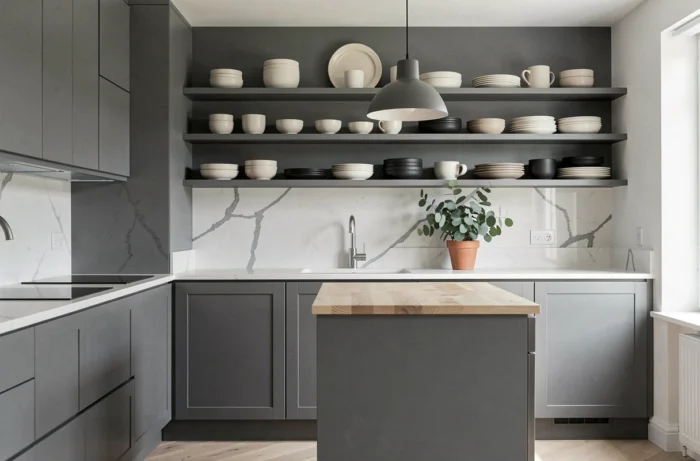
- In a bedroom, a light greige on the walls combined with white bedding creates a soothing atmosphere without coldness.
- In the kitchen, a medium gray on cabinet fronts pairs well with a solid wood or natural stone countertop.
- In a bathroom, a dark gray on a shower wall (in tile or resin) adds depth without visually reducing the space, provided the rest is light.
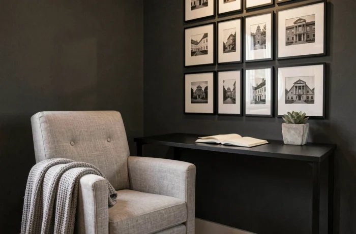
Gray remains a solid ally in interior decor, as long as it is treated as a material to work with rather than a default neutral choice. Testing the undertone under your own light, varying the textures around, checking the paint emission class: these three concrete actions make the difference between a successful gray interior and a space that lacks character.